Joe's
Autism Page
those
little graphs...
Prof.
Simon Baron-Cohen's book, The Essential Difference, contains a
half-dozen little graphs. More accurately, perhaps; it contains
essentially the same graph, replicated a half-dozen times with
different labels on the axes. This is okay – the graph is used
to communicate a point to a non-technical audience. However, I
believe the graph is used improperly and is not consistent with the
author's central argument.
First
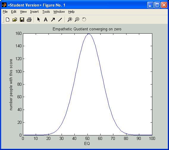
– some nit picking. The graph is the standard 'normal
distribution' (i.e., “bell curve”). The first point to be
made is that the empathy quotient (some metric that attempts to
describe quantitatively how much empathetic intelligence a person
has) is normally distributed. That is:
most
women (or men, but lets examine one gender at a time) have an
'average amount',
a
fewer number have more than average or less than average,
and
a small number have much more or much less than average.

As
you move outward from the 'norm' (the center of the distribution) the
graph should approach zero asymptotically. None of the author's
graphs show this. For some reason he insists on drawing all the
graphs with a 'DC offset' – that is, converging on a positive
value greater than zero (as shown above). The result seems to say “as
you get to the extremes, a substantial residue
of people can still be found”.
It would be nice if the
author plotted the graphs as shown below, without the 'DC offset'.

End of 'nit'.
Next
point... the big one.

